


I like yellow best when I can see pink at the same time.
Why is that?
It’s not even a certain kind of pink and a certain kind of yellow that’s appealing, but really it’s any pink and any yellow combination that works (should test that theory).
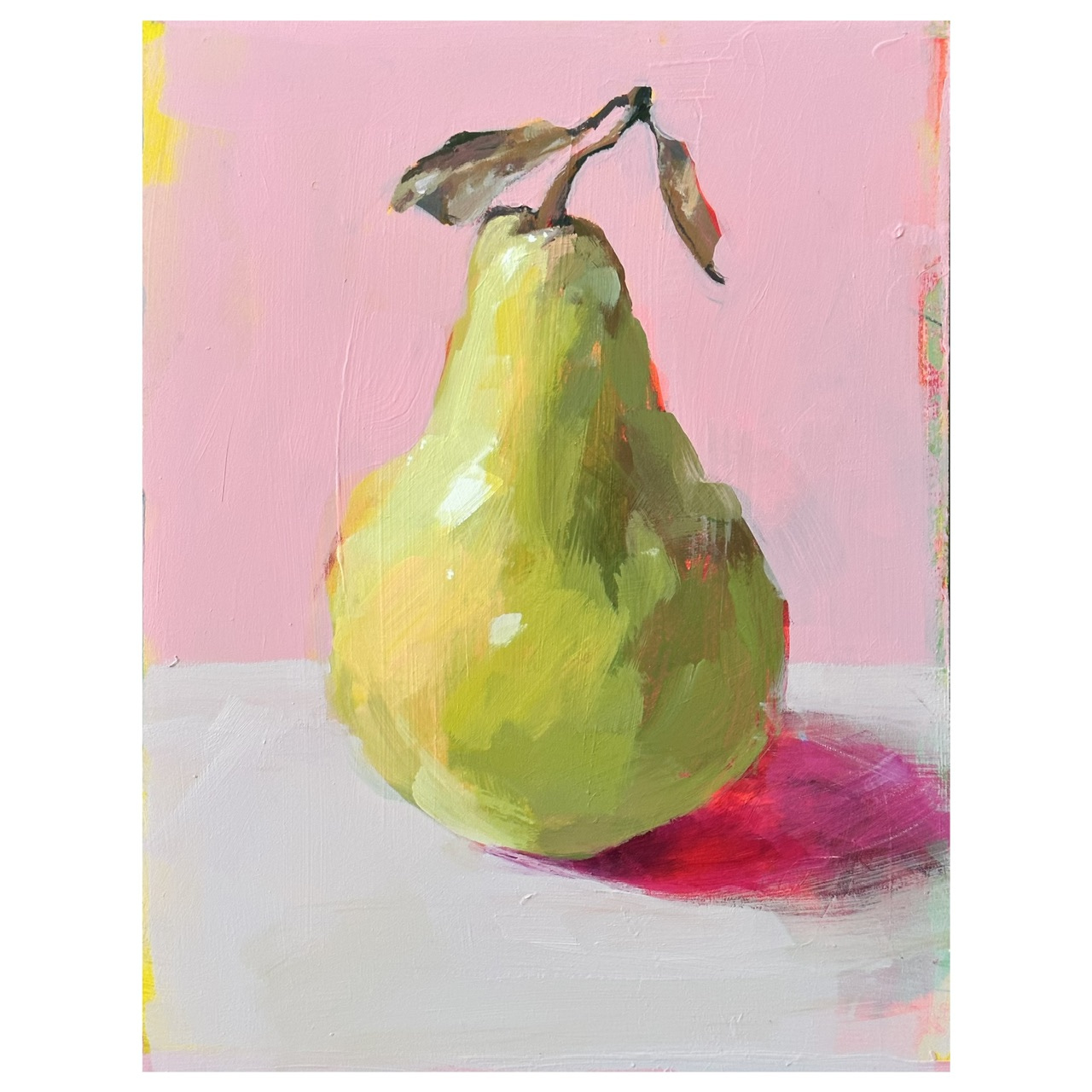
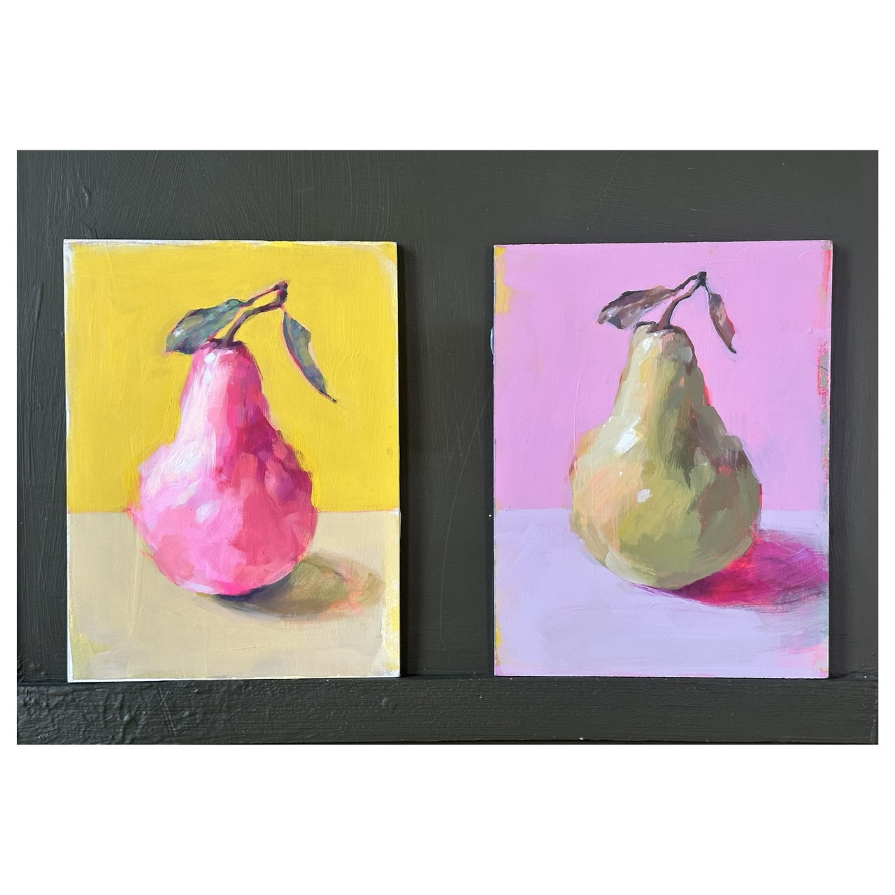
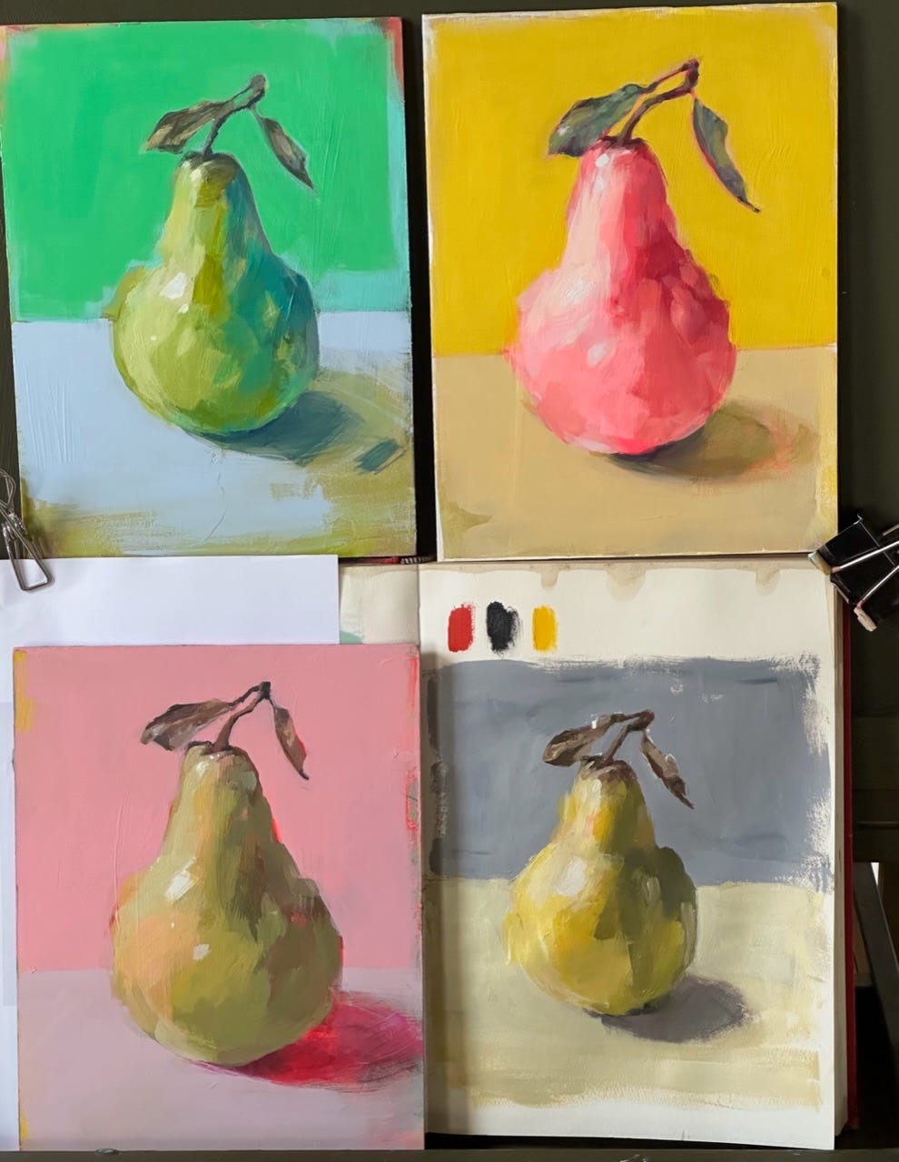
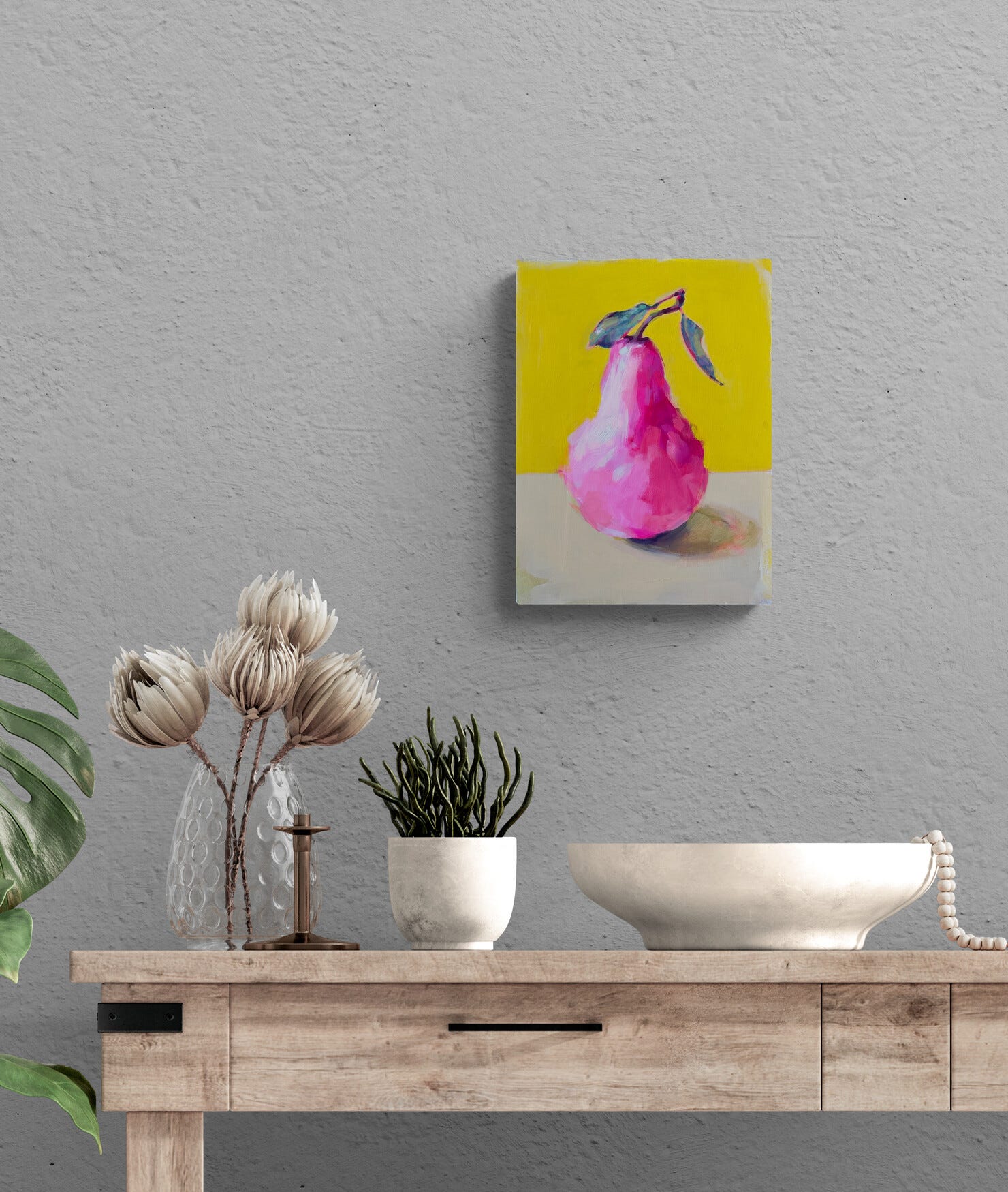
I painted this pear using my pink and yellow theory, and as I was painting this I wondered if it would work the other way around - pink pear yellow background,

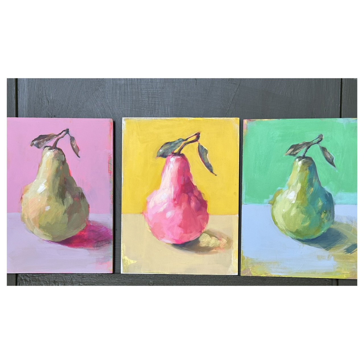
Both pears work as well as each other I think, or maybe they work well together, they look better together than separately.
What is it about pink and yellow that makes it so pleasing? Pink is red mixed with white - I also mixed white with my yellows for this, I noticed.
Hmmm…
To try something different I thought I’d play with blue and green to see what I come up with.
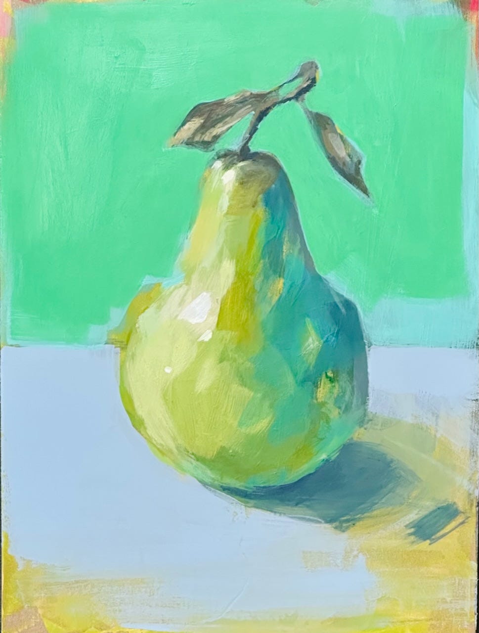
It works, but note the blue choice is really light and soft, and most of the painting is green.
I notice I use a lot of white to tint my colours but no black to tone them in any of these combinations. I should try one with black…
I wonder if I could pull off this pear painting in a colour combo that I don’t find pleasing - red, yellow and blue - the primary colours.
I choose cad red, cad yellow and carbon black + white. I don’t love the warm cad red next to the warm cad yellow, and I rarely use black - I’m just asking for trouble - but as I’m painting I realise it’s very similar to the Zorn pallet.
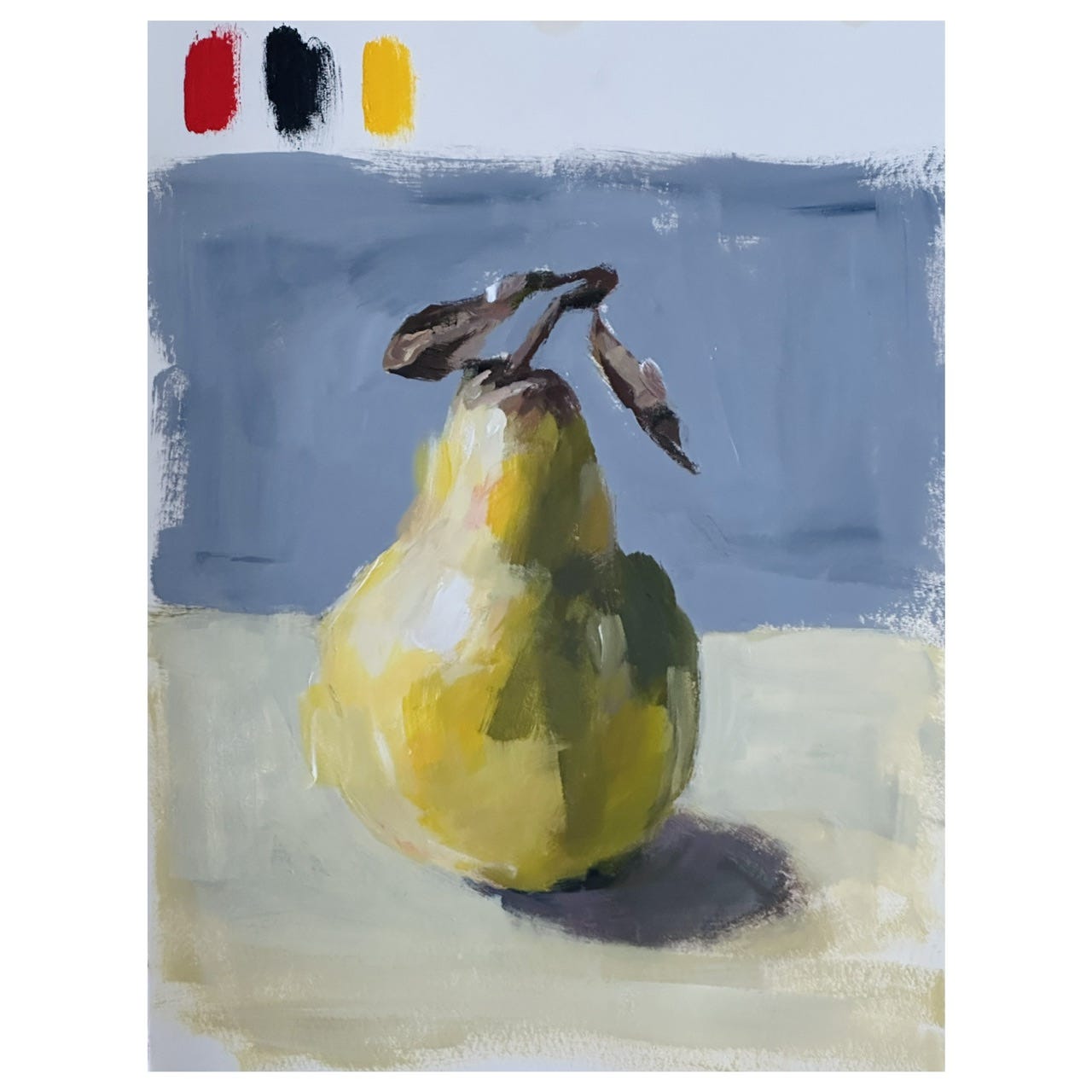
The Zorn pallet - except that traditionally it’s ivory black and yellow ochre with cad red and white. The cad yellow makes more of a green when mixed with the black because it’s so strong and I don’t have ivory black in acrylics so carbon black is the next most neutral black.
So what did I learn from this bit of play?
All colour combinations can look good with the right amount of white mixed in.
Fancy that!
Very interesting exercise Cat. I loved it